Win the First 5 Seconds: The YC Landing Page Formula for Early-Stage StartupsA practical field guide for first-time founders + 180 YC Landing Pages That Helped Raise $400M+YC-style pages win by promise, speed, and de-riskingBefore anyone signs up, books a demo, or even tries your product, they make a subconscious decision in five seconds: Is this for me, or not? That’s the exact moment that decides whether your traffic converts or vanishes. Great startup landing pages don’t just look clean or clever, they do three things fast: make the right promise, remove friction to the first “aha,” and de-risk the decision to engage. Forget aesthetics. This is a conversion system. And YC founders are expected to master it before they launch anything. Here’s a cold hard truth. Across 57 million conversions and 41,000 pages, the median landing page conversion rate is just 6.6% [source: Unbounce]. Top-performing startups often exceed 10–15%. Most early-stage pages underperform badly. This guide gives you the blueprint to beat that. You'll walk away with a tested page structure, a 10-point checklist, and conversion tactics you can ship this week; all grounded in what YC expects from founders and what real users respond to. Let’s build a page that earns the click. Brought to you by Sintra - Your employees, on AIGrow your business faster with an AI team that works 24/7 just for you
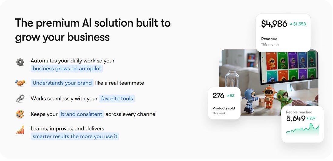
Sintra’s AI Helpers can simplify your business without costing an arm and a leg. Whether it’s managing your social media calendar, sending and responding to emails, or coordinating and executing your website updates, Sintra’s AI Helpers can be personalized for your business.
Table of Contents1. What YC Actually Recommends (And Why The Data Agrees) 2. The Hero Section: How To Win The First 5 Seconds 3. Tell The Scar-Tissue Story: Problem → Agitation → Transformation 4. Pricing On The Landing Page: Clarity First, Psychology Second 5. Social Proof That Reduces Risk (Not Just Looks Pretty) 6. Objections, Answered Where They Occur (A.K.A. The Mini-FAQ) 7. The 90-Minute Makeover (First-Timer Checklist) 8. The Optimal Page Structure (Copy-And-Ship Blueprint) 9. Go Beyond: Nice-To-Haves Others Don’t (Win The Edges) 10. Ship Pages That Earn Belief
1. What YC Actually Recommends (And Why The Data Agrees)YC doesn’t give design advice to make things pretty. Their focus is one thing: conversion. Here’s how they expect founders to build landing pages that actually work, backed by startup results and hard data. One Page. One Job.Every landing page should lead to one clear action. Not a navigation menu of choices. Not five buttons. Just one thing you want the user to do. That’s it. Pete Koomen (Optimizely co-founder, YC alum) calls it the 1:1 attention ratio; one core message, one call-to-action (CTA). This keeps the user focused and reduces friction. If your primary CTA isn’t obvious in two seconds, you’ve already lost the click.
Clarity Beats MotionDrop auto-sliding carousels, gifs, videos. YC’s teardown team calls these “conversion leaks”, because they bury your best pitch behind animation that users don’t wait to see. Instead, you should front-load your strongest benefit statically. If you have multiple points, use a clean layout or tabs. Let the user scan. Don’t make them chase value.
Simple Words. Faster “Aha.”If your copy reads like a pitch deck or policy doc, it’s too complex. YC’s internal advice is simple: “Would your mom understand this headline?” If not, rewrite it. And this is backed by data. According to Unbounce’s report, high-grade-level writing with difficult words converts almost 25% less than simpler copies.
Simply put, you are not building thought leadership through your landing page. You are converting visitors who already heard about you. Use shorter words, direct verbs, no fluff. Rule of thumb: If your headline wouldn’t make sense to a smart 12-year-old, fix it. 2. The Hero Section: How To Win The First 5 SecondsWhen a visitor lands, they make a snap judgment: Is this for me? You have one screen to answer yes. That’s the job of your hero section. Nothing else matters if this part fails. A high-converting hero delivers clarity, action, and proof; without fluff or friction. Here’s how. Use the Outcome-ICP-Pain FormulaYour headline should speak directly to the user and what they get. This is not about what you built. Formula: Outcome for [ideal customer] without [common pain] That’s sharp positioning. Examples:
Avoid headlines like “The Future of Finance” or “We Power the World’s Teams.” Nobody knows what that means. Be literal, be useful, and be fast. Rule of thumb: If your hero copy requires a second scroll or a demo to be understood, it’s failing. Lock In One Primary CTAYour hero section exists to drive one clear action. “Try free.” “Get a demo.” “Start now.” One primary CTA. Not three buttons. Not a split path. One. If you’re targeting developers, a secondary CTA like “View Docs” or “Run CLI” can sit nearby, but never compete for visual attention. Test question: If someone screenshots your hero, can they tell what you want them to do? Show the Result, Not the InterfaceA static dashboard screenshot isn’t enough. Users want to see the outcome before they commit. The best YC landing pages embed a 10–60s loop or interactive clickthrough that shows the magic fast. Think: a mini chat, a data transformation preview, or a short screen-recorded result. Why it works:
If you must use video, place it directly below or beside the CTA, overlay a clear play button, and include a caption: “Watch how it works in 45 seconds.” Callout: Five Checks for Your HeroMake sure your hero passes these five conversion tests:
3. Tell The Scar-Tissue Story: Problem → Agitation → TransformationMost startup sites just throw features at the user. The best ones show a before-and-after they can feel. This is where your page earns trust. A strong problem narrative tells users: we’ve been in the mess you’re in, and we built our way out. Here’s how to structure it so it converts: Before: Show the Pain That Stalls ProgressStart with the real status quo, the part of the workflow that’s slow, expensive, or soul-sucking. This isn’t about surface-level frustrations. Go deeper. Before: Support teams were buried in basic account reset requests. Don’t make this generic. Use the exact phrasing customers use on support calls and demo objections. If someone said “we’re drowning in tickets that aren’t even bugs,” build off that and don’t just summarize it. Agitate: Highlight the Hidden CostOnce you’ve named the problem, press on it, but gently. Your goal isn’t fear, it’s urgency. Agitate: The backlog delayed feature rollouts, hurt onboarding scores, and left high-LTV users frustrated. Skip clichés like “chaotic” or “messy.” You need to show the real business impact. Great landing pages don’t just say “this sucks.” Potential customers know that. Great landing pages say “here’s what this bottleneck is really costing you.”
After: Prove the Transformation (with Numbers If You Have Them)Now give them the “after” state: what changed, and how it made life better. One line of impact, followed by how the product delivered it. After: Onboarding time dropped by 60%, and 92% of resets now resolve automatically. Quantify only if you’ve got real numbers. Otherwise, keep it qualitative, but specific. Rule of thumb: If your “after” doesn’t feel better than the status quo, rewrite it. 4. Pricing On The Landing Page: Clarity First, Psychology SecondNothing raises bounce rates faster than confusing or evasive pricing. Your landing page isn’t just a sales tool, but a trust contract. And nowhere is that more visible than how you handle cost. This section is all about designing a pricing experience that makes the right users say “yes,” without regret, confusion, or second-guessing. Build a Table That Tells the TruthStart with a three-tier layout. It works because it gives users context, comparison, and control. Structure each plan around your real ICPs, not vague labels like “Starter” or “Premium.” What works:
Avoid dark UX tricks. No buried costs. No hidden fees. No checkout surprises. Pro tip: If your own team can’t explain who each plan is for in one sentence, neither can your customers. Use the Decoy Effect, EthicallyOne psychological tool worth testing: the decoy effect. By adding a clearly inferior third option, you make your target plan feel like the obvious choice. This effect, first studied by Huber, Payne, and Puto (1982) and later popularized by Dan Ariely, hinges on asymmetric dominance. If Plan B is better than Plan A in every way, but only slightly more expensive, it draws users away from Plan A and toward your real goal: Plan B.
But here’s the guardrail: only use “Most Popular” badges if the data backs it up. If 70% of your users pick that plan, go ahead and show it. But if not, skip the badge. Don’t gaslight your customers into a fake preference. That’s manipulation territory. Price Is a Friction Point, So Reduce the RiskDon’t just show prices. Show what happens if the user isn’t ready. Right near your primary CTA, place a risk reducer:
Make this adjacent to the decision, not buried in the footer or FAQ. When someone’s finger is hovering over “Start Now,” the thing stopping them isn’t a feature question, it’s fear. Address it right there. Freemium vs. Free Trial: Tie It to ActivationIf you’re deciding between freemium and free trial, let data guide you. Freemium works when users reach value before they hit a paywall. Free trials work better when value is clear but delayed, and the upsell path is short. If you’re seeing too many free users stuck at “tire-kicker” level, move to a time-limited trial with guided onboarding. Let users taste the magic, then ask for the upgrade. And don’t be afraid to say goodbye to freemium if it’s creating drag instead of lift. 5. Social Proof That Reduces Risk (Not Just Looks Pretty)At the edge of conversion, users hesitate. Social proof exists to make them feel safe, not impressed. The goal is to establish your credibility instead of looking cool. Done right, social proof can lift conversions by as much as 20–30%, especially when it’s placed strategically and says something specific. Start with Who Else Trusts YouThe fastest way to build credibility is to show that others already do. If you have well-known customers, place a logo strip near the hero or pricing, not buried in the footer. Six to ten recognizable brands is the sweet spot. But don’t fake it.
If you do not have logos (yet), use count-based proof or category credentials instead:
These work because they reduce fear. They don’t necessarily say “we’re big.” But they indicate that “you won’t be the first.” Reminder: Never display logos you don’t have permission to use. “Aspirational” brands erode trust the second someone calls you out. Use Testimonials That Say Something RealThe best quotes are real outcome stories and not just compliments. They look something like this:
Include full name, title, and company. No “Happy customer” or “Founder, stealth mode.” Generic praise (“Love the product!”) doesn’t convert. Specific outcomes do. Rule of thumb: Every quote should map to one core benefit from your product. Backed by People Who MatterIf you’ve raised from known investors, show it, subtly but clearly. One clean row of logos, including YC, venture capital firms, or angel investors, near the pricing section or final CTA is enough. If you can’t show logos (NDA or stealth), don’t fake it. Only use “Backed by top-tier investors” if it's true. This section is your “soft armor”. It reduces perceived risk. 6. Objections, Answered Where They Occur (A.K.A. The Mini-FAQ)When someone’s ready to click “Start free trial,” their finger pauses. Not because they’re unsure what your product does, but because they probably have one last nagging question. The mini-FAQ is your conversion insurance. Placed right next to your pricing or CTA, it clears those final mental roadblocks without forcing a scroll, a new tab, or a support chat. The goal is to reduce friction. Why This WorksYC partners push founders to shorten time-to-value and reduce cognitive load. This does both. It prevents a bounce at the moment of intent, and it shows empathy for the user’s real decision-making process. Bonus: it also deflects unnecessary sales calls. If your product is self-serve, this is your free Sales Development Representative. What to Include (and Where)Your mini-FAQ should live directly beside the primary pricing CTA, not in the footer, and not behind a “learn more” link. And each answer should be one sentence, plus a link for details. Key topics to cover:
This section should reflect your brand’s tone. If your product is casual and founder-led, write like a human. If you serve enterprise clients, stay crisp and formal. Either way be real, be short, and be near the button. 7. The 90-Minute Makeover (First-Timer Checklist)Review your landing page. If it doesn’t need a full redesign, it might at least need a sharper first impression. This checklist is for early-stage teams shipping their first real landing page, or cleaning up one that’s been “good enough” for too long. Block 90 minutes. Follow the steps. Watch what happens to your conversion rate. 1. Rewrite Your Hero HeadlineUse the formula: Outcome for [ICP] without [pain]. Drop slogans. Lead with value. 2. Pick One Primary CTADecide what you want users to do, and delete every other button fighting for attention. 3. Add a Micro-DemoEmbed a 10–60 second loop or interactive preview that shows the result, not just the interface. 4. Ditch the CarouselIf your hero has an animated slider, replace it with a static layout or tabs. Let users scan, not wait. 5. Add Proof Up FrontPlace a logo strip + one named testimonial near the hero. Put trust before the scroll. 6. Simplify Your Signup FormAsk for email + one qualifier, nothing more. Enable Google/SSO sign-in if possible. 7. Launch Transparent PricingUse a 3-tier table with clear usage fences. Add a risk reducer like “14-day refund” near the CTA. 8. Insert the Mini-FAQPlace a 3–5 Q FAQ beside pricing. Hit common objections: security, integrations, ROI, refunds, setup. 9. Tighten Page SpeedCompress your hero media. Lazy-load everything below the fold. Aim for <2s total load time. 10. Measure What MattersPick one success metric such as “% of visitors who click primary CTA” and start tracking it today. 8. The Optimal Page Structure (Copy-And-Ship Blueprint)Founders don’t need a 40-section Figma file to build a great landing page. What they need is a clear, one-screen layout that earns attention, shows value, and invites action. This is the architecture that works across YC startups, high-converting PLG tools, and fast-moving bootstrappers alike. 1. Hero
Why it matters: This is where you win or lose the first 5 seconds. This is where you need clarity, outcome, and action. Fast.
2. Problem → TransformationThis section should ideally be 2–3 short blocks, each with one problem, one outcome. Each includes a benefit (“X got easier”) and a how (“Here’s what changed”). Why it matters: This builds the story users already believe, then shows how your product solves it. 3. How It Works3 steps (e.g. “Connect your data → Customize alerts → Get insights”). One line each, with a second CTA below. Why it matters: Light explanation satisfies curiosity without forcing a scroll through documentation. 4. Social ProofTestimonials with names, titles, and companies. A logo strip repeated for reinforcement is a great addition. Optional: a row of investor logos (YC, angels, etc.) near this section. Why it matters: Safety, credibility, and tribe validation. It answers “Who else trusts this?” 5. PricingIdeally, a 3-tier plan table with annual toggle and usage-based fences. Don’t complicate this with more plan tiers. Trial/refund note placed beside or below the primary CTA. Why it matters: Removes ambiguity and fear. Good pricing pages convert better than great feature pages.
6. Mini-FAQ (Right Beside Pricing)Answer 3–5 key objections (security, integrations, ROI, time to value). One sentence per answer. Link out to full details. Why it matters: This stops bounce at the moment of decision.
7. Footer
Why it matters: Clean, useful, and trustworthy without any filler, and, of course, no fake newsletter signups. 9. Go Beyond - Nice-To-Haves Others Don’t (Win The Edges)Once your landing page is finally converting, the next unlock is to add strategic depth. These upgrades won’t ship on day one, but they separate the good from the great over time. They build SEO strength, buyer confidence, and asymmetric trust, all of which are advantages that most early teams overlook. Comparison and Alternatives PagesFounders tend to avoid these out of modesty. But that’s a mistake. Pages like “You vs. Competitor” or “Alternatives to X” rank well for bottom-of-funnel keywords and clarify your position in the buyer’s mind. You could open with 2–3 lines explaining your angle: who you’re best for, and why. Use a simple 5–7 row table: highlight trade-offs, not just wins. End with a CTA that speaks to your strength (“Try us if you value speed over customization”).
SEO Hygiene for Quick WinsYou don’t need an agency to get this right:
These small details compound over time and help your landing page earn organic traffic without the need of a blog. Use Case and Integration PagesThese pages are SEO workhorses. They capture intent and remove uncertainty. Pages like:
Each one should include a clear outcome (“Save 8+ hours a week by eliminating dashboards”), 3 benefits tied to that use case or tool, a short “how setup works” section, and a tailored CTA. Programmatic SEO isn't just for marketplaces. Even a few of these pages can give you outsized reach and relevance. Lead Magnets That ConvertA good lead magnet is better than a newsletter. Create one tactical asset such as a checklist, ROI calculator, launch script, onboarding template, and gate it with email-only access. Then send three emails:
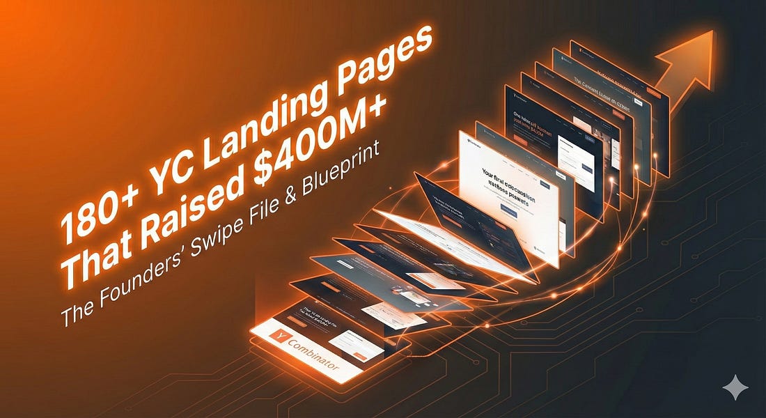
You’ll build a list that actually wants what you’re selling. Free Tools = Evergreen CredibilityOne of the highest-leverage trust moves: ship a lightweight tool. Give away some value, for free. Think calculators, generators, benchmarks; something your ICP would actually bookmark. No login required. Optional email gate. Link it from your footer for long-term discovery. Promote it on comparison, pricing, and FAQ pages to signal utility beyond the pitch. And do you know why free tools are important? Because they build reputation. 10. Ship Pages That Earn BeliefYour landing page shouldn’t be a brochure. Ultimately, this is your first investor meeting. Your first cold pitch. Your first yes. The best YC-style pages don’t convert by being clever, they win because they’re clear, fast, and trustworthy. You’ve got the blueprint. Now earn the click. 11. 180+ YC Landing Pages That Helped Raise $400M+
YC startups have raised more than 400M dollars using the pages in this swipe file: Keep reading with a 7-day free trialSubscribe to The VC Corner to keep reading this post and get 7 days of free access to the full post archives. A subscription gets you:
|
Win the First 5 Seconds: The YC Landing Page Formula for Early-Stage Startups


Posted by WE BRING YOU THE BEST!
 VHAVENDA I.T SOLUTIONS


0 Comments
VHAVENDA IT SOLUTIONS AND SERVICES WOULD LIKE TO HEAR FROM YOU🫵🏼🫵🏼🫵🏼🫵🏼